Monday, February 25, 2013

Gradation

1.

A nice example gradation as you can see a slow transition from small oblong circles to larger ones or vice versa depending on the viewpoint. It's showing spatial progression as you can see that size changes in a backward sort of progression.

2. 

This cake has a parallel movement in which the unit forms transforms gradually in a straight line downward.  The many different degrees of gradation and the solid lines separates these areas into different segments of the same steps. 

3. 

This definitely defines gradation as the bottom shows an optical illusion, creating a feeling of progression leading to a series of climaxes. This is spatial gradation by it's progression by also changing from different shapes (foreground of blurred lines, to clear picture presumed to be in background). The shape in the foreground (blurred lines) aslo tend to show tension as they look pulled outward. The speed of gradation was extremely fast due to it simultaneously drifting to blurred lines or vice versa.

4. 

Concentric movement is the main pattern for this gradation. The climax is in the middle and notice how the spatial progression pulls this back. This shows each layer moving in a slow gradation to the next, guiding the eye the main point in the enter.

5. 


If slowed down to show a smooth progression or transition, this gradation would quickly shift from the south western  to the north eastern corner of the plane signifying planar progression. The pattern also seems to direct toward moving in a zigzag sort of motion (as the tie curls or bends around to the next side).
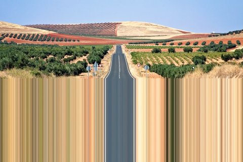
6. 

This picture of multiple images  share a shape gradation as each image added gradually transforms this into a unified composition. This looks like it was really fast due to the multiple images changing not to drastically, but enough to where it substantially  looks as if it happened in only an instant.
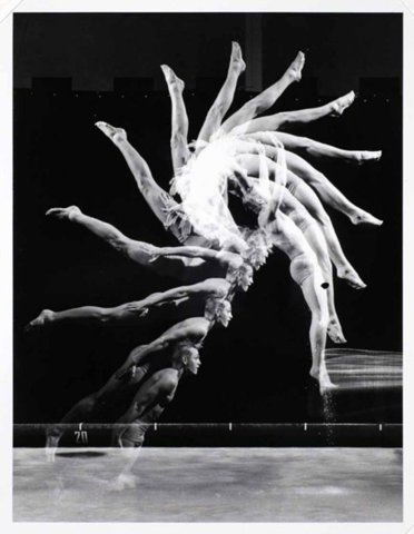
7. 

Just by changing the position or shape of each bone makes a rift in this composition. It makes it seems like it's going in many different directions at once or that it somehow zigzags.

8. 

Not much of gradation but the slight tip over to the right, and it's only a matter before gravity have it's course creating another movement.  The structure of course seems to be be curving or bending towards the right.

9. 

The slow transition between the oldest (biggest) the newest phone (smallest) gradually shows the spatial progression of this gradation. The decreasing size shows a shift ( or movement) of the phones moving backward and to the right.

10.

Let's finish this chapter of Gradation with a picture that has an all over type movement or in other words shape gradation. The lines tend to compress inward also making the picture seem elastic.


Sunday, February 24, 2013

Similarity

1.
Let's get started with a simple picture of corn. We have an idea shape of a piece of corn, but it's clear to see that though each piece is somewhat similar it's imperfect. Some pieces are disfigured, transformed, cut up, or even broken. The pieces of corn may not be identical or repetitive but they are none the less similar.

2. 
I thought this picture may have been another example of similarity. The font is different for "trust" and "your", and they even have different design concepts. They are similar by association, as you can see that they are all alphabets. However different by designs they manage to still contribute to the purpose.  No matter how much cognitive dissonance (different ideas : different designs) tries to get in the way and make you doubt yourself, "Trust Your Gut".

3. 

Let's add union into the mix of similarity. These two smaller and different color circles converge together to make what's similar to a Venn Diagram. I also like the two words that creates similarity to the middle zone or the little arrow to the side that says "Awesome".

4. 

I love how beautiful and creative the designs are that people tend to make. Especially this nice architecture that and architect has manage to make similar by what seems to be tension. This is when a form has been stretched (by an internal, or external (in this case) force, which pushes the contour outwards). Love how elastic they make this architecture look.

5.

The fingers actually show similarity in the sense of spatial distortion. However bent in a position (as you can see the hand is turned to the side), the fingers still can result in a many different spatial distortion.

6. 

Similarity doesn't just show up in shape it can also show up in the structure or in this case visual distribution of the composition. Visual distribution allows each unit form to be in the same amount of space as it would be judged by our perception. There seems also to be no guidance of structural lines.

7.

This picture really captures the saying "the eyes are the window to the soul", but I choose this picture just because of it's simplicity. The eyes albeit not exactly the same shape does have similar features that balance the weight on either side of the composition.

8.
I really enjoy how the circles seems to compress or draw the eye straight to the center, each circle getting smaller to the next. The similarity is definitely in the shape, no matter how the size differs. This also alludes to spacial progression of gradation but that is for the next chapter.

9.

I definitely want to say that this is similar by it's spatial distortion. Even when some of the parts of the bag is bent or twisted and no matter in how it is rotated, each bag still remains similar to the next.

10.

Let's leave this chapter of Similarity with taste. No matter what position turned in, they are also the same size just different depictions of the flower, and the envelopes leaves a nice sense of elegance to an example of similarity.


Monday, February 4, 2013

Super-Unit-Form & Sub-Unit- Form

Super-Unit-Form

1.

Perfect example of super-unit-form in my opinion because all of the repetitive shapes of people standing creates the image of a horse. I also like the white shirt people creating what I would assume to be the harness or lines of the horse face.

2.

This look like a pretty good picture that show a sub-unit-form. The spirals appears to shrink the further down it goes. This repetition looks like more like it's following an circular arrangement.

Unit Forms


Repetition

1.

Graphic I know but it makes a point to show our becoming status of today. Identity crisis and too afraid of hurting someone's ego many of us are slowly becoming like-minded (due to conformity) and weak. To describe the design aspect of it though, this repetition makes a good example of a unit form. This gives off an eerie harmony as the if you look at it for the whole picture it has a sudden flow or rhythm with the people wearing the same tattoo. It also has a directional variation as their heads seems to be pointing toward a focal point (cropped off) in the north eastern direction.

2.

Loving this natural design of a cactus plant that spirals inward or outward depending on the way you look at it. If you cut it in half it will definitely look just like a mirror image or a reflection.

3.

There is repetition in the shape itself as well as the lines on the figure. I love how the arms create the lines of force as it appears she may be dancing. Just for randomness she also looks like the singer Florence from the group Florence and The Machines.